The sublime shade of Periwinkle has been elevated, on its 100th birthday, to Veri Peri by Pantone, the New Jersey company working with the universal commercial colour spectrum. With a new fervour, this hybrid within the violet sphere is being rolled out like a tsunami through high street stores in fabrics and accessories, lighting and paints. And the Pantone Institute has declared that it developed this colour to reflect our time of global transition.
Botanical origin
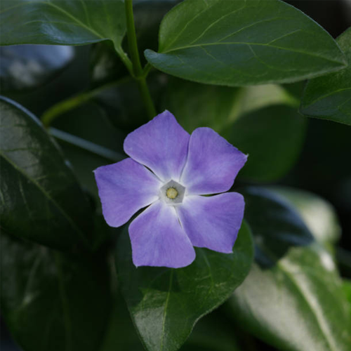
Gardeners will know the periwinkle plant as one that spreads rapidly covering ground surfaces, producing starlike flowers of a purity which are inspiring and healing. A Caucasian perennial that remains verdant all year round, it adapts easily to urban or greener rural environments. Just so, on internal surfaces, this represents a luxury skin of colour in Impera Italia’s range of interior design products* available this year.
UNIQUE qualities
The superior radiance of Veri Peri is unprecedented and unequalled. As a feature wall, there is no doubt it will look truly remarkable and have multiple therapeutic effects. It is being chosen for bedrooms and bathrooms in the first instance, then percolating into living areas for its invigorating qualities. The more daring householders are using it externally on frames and render, to create a highly innovative and impressive statement.
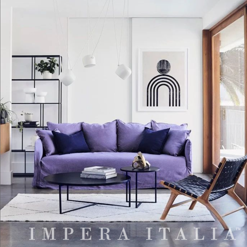
At Impera Italia, Veri Peri has now been incorporated into pigments to enable a full-blown experience of this miraculous colour, which is also invaluable in the subtle management of hypertension – an integral aspect of Italian interior decor.
*Please ask for no. 17-3938 and note our relevant product lines include Gimcyn luxury, Sioloc suede, Marmorino supreme and Luciano polished plaster. Our experts are always ready to help with queries and practical applications.
Complementary colours
To complement this tone, we suggest a golden range: saffron, ochre, russet – those colours which were favoured by Toulouse Lautrec, the famous 19th century Art Deco artist. As he lived to only age 35, he expressed a constant vitality in his paintings. And lime green also balances Veri Peri beautifully. This colour range may be found in matt or metallic shades within our stock.
- We recommend that you treat yourselves, after the 2-year constrictions of COVID, to a rejuvenated customised landscape, leading to fresh harmonies and aspects of self-development. This is the mission statement of Pantone and a very powerful one. A great opportunity to start over and accept the challenge to redefine intimate priorities.
Enter the Metaverse! Pantone is also pairing up with Microsoft to create Office wallpaper backgrounds in Veri Peri, allowing the maximal effect of this extraordinary colour. Therefore you’ll be able to work on your devices with greater ease and inspiration, restful for the eyes and stimulating for the intellect.
CODING
The hexadecimal code of 16 colours in a digital palette originates from the word hex (hagazussa in Old High German) or SPELL – with the hypnotic effect of colour vibrations understood. Witchcraft = definitely involved here, with #CCCCFF representing Periwinkle.
NATURAL LIGHT
Inside your own property, it’s a wise strategy to study how the daylight enters the space of each room and how that affects the quality of internal light. It may bounce off the surfaces of the wall or be absorbed by it. But in all cases sunlight will alter the general colour tone, hour by hour. You may also care to take a look at the principles of Feng Shui to adjust the furniture within the rooms for optimal energy flow. Then you will be in a better position to select which surfaces to give a new coat of paint to.
But give it maximum exposure rather than camouflage it with large objects. At Impera Italia, staff can advise on site as to some beneficial colour combinations and show samples of the gorgeous Veri Peri shade in use.
EXTERNAL application
Externally, Veri Peri colour can create a tremendously positive statement and be a stunning backdrop to tall herbaceous plants and flowers of contrasting pinks, reds and purples. It is also hugely enticing at the end of a driveway or entrance path, like something in a fairy tale. Be the innovators in your area! You’re entering a legendary dimension! Venetian stucco is a perfect container for this colour, with its topmost quality of durability in our increasingly variable climate. Make this transition and you will not have any regrets.
For Valentine’s Day, plan something unusual for your beloved: a new makeover inside the bedroom, which will freshen up all aspects of your life, adding a little mystery, intrigue, magic, and joy. Let’s Veri Peri! Children will also love it: it will generate a lot more laughter and innocent playfulness. But – ALL of your family can potentially enjoy the benefits of this special colour, however, you decide to use it. Carpe diem – seize the day!
- When you have embarked on this adventure, you may like to make a tea infusion from periwinkle vinca leaves and flowers, together with either mistletoe or sage. There are specific health benefits to be gained, such as expansion of blood vessels in the brain, leading to improved focus and better memory powers – combating degenerative diseases such as Alzheimer’s. It also boasts astringent and antiseptic properties. Its alkaloids work against diabetes and cancer, too – so a MIRACLE herb as well as a stunning flower – which explains why its common name is: Sorcerer’s Violet.