Colour of the year 2023: VIVA MAGENTA
Magenta Pantone colour of the year 2023
With each new year, we have a new colour for the year ahead. At the end of 2022, the following year’s colour was announced by Pantone, the influential colour institute, known for its colour-matching system.
This year, with the choice of Viva Magenta, the establishment’s influence can be felt across all industries, as designers and decision-makers alike strategize to introduce the colour in their respective fields, finding the most efficient yet harmonious way to keep in line with the trends.
At Impera Italia, we want to make sure that our clients who feel inspired to implement this year’s colour in their interiors are able to do so with our products!
What is Viva Magenta?
Descending from a family of reds, the Pantone 18-1750, known as Viva Magenta, has been named colour of the year for 2023. According to the experts at the colour institute, this is the colour that best represents the current year. It’s a crimson red shade that is neither traditionally red, nor a bright, hot-pinkish magenta.
Viva Magenta is an “unconventional shade, for an unconventional time”, according to the institute’s article, explaining the thought process behind the choice.
This electrifying and boundless colour redefines how we see ourselves and the world.
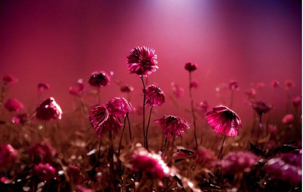
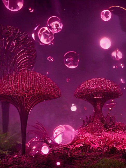
It was introduced by Pantone in a presentation that bridges the gap between natural and artificial, using Midjourney’s AI technology to create the “Magentaverse”. It is an unconventional shade, as whilst it descends from the reds, it brings with it a “sense of warmth”.
It is far from the usual representation of the bold tone we are used to. 2023’s colour is the subtly assertive interpretation of Pantone of the coming months; the attitude and trends present in our society, and their prediction of what 2023 entails.

What is Pantone’s colour of the year?
Since the millennium, the colour institute names a colour for each year that they feel best represents the phase we are experiencing collectively as a society.
Given Pantone’s position in the world of design and colour theory, this choice boasts an unparalleled influence across all types of different industries. Viva Magenta, as 2023’s colour, is a good example for that.
Taking inspiration from nature, the cochineal – a bug famously used for red pigment – and blending it with the artificial, in the AI created Magentaverse, the animation aims to give a snapshot of the revolutionary phase we are experiencing. A great illustration of how technology is influencing our life, both in a practical and theoretical sense.
What are the origins of Viva Magenta?
Starting with the sensational mauve colour that was a result of the industrial revolution – which has also influenced the field of chemistry- the colour magenta was originally created by a French chemist, François-Emmanuel Verguin, which he started to manufacture in 1859.
A few years later, in the laboratory of George Simpson’s paint manufacturing company, Nicholson and Maule, two British chemists came up with a similar colour, which was given a different name, and they started to manufacture it in 1860.
How did Viva Magenta get its name?
When first created in 1859, the colour magenta was originally called ‘Fuchine’, as the French chemist decided to name the colour after the flower of the same colour. The second version in 1860, was manufactured under the name ‘Roseine’.
After the French victory in a battle against Austria, at the Italian town Magenta, the colour was renamed in 1860. And it became a success under this name.

How to employ Viva Magenta in interior design?
Pantone’s colour of the year has a considerable influence across all industries, interior design is no exception.
The colour magenta has been around for a while and so is the red. But the way in which they are represented in the colour Viva Magenta, brings a new refreshing dimension, that you can now easily introduce into your home.
In an interview with Architectural Digest, Leatrice Eisemen, the Pantone colour institute’s executive director pointed out that according to the trends they see in interiors, people are becoming bolder when using colour.“People have reached a point now where they’re a bit braver with where they might use a touch of colour, and a touch doesn’t mean just a pillow just to throw on the sofa anymore. A touch can mean a couple of walls.”
Interior design, therefore, is being revolutionised by the introduction of bold and unique tones, and to help inspire anyone looking to redecorate, the institute placed Viva Magenta in a few of their already well-known and loved palettes; the Family Ties, Equilibrium and Ignite palettes.
Explore Viva Magenta with Impera Italia!
Which products do we recommend?
When it comes to choosing bolder tones for our home, a lot of the time we tend to prefer colours that complement the palette that is already present in our furnishings; pieces we don’t want to throw away. Be it an antique table, or a nice sofa.
Whether you’d prefer to add a feature wall, or to fully redecorate, the Impera Italia team would be more than happy to help you find the right products!
At Impera Italia, we offer a wide range of products that can be customised to match the exact shade of Viva Magenta. Different products of course mean different finishes; no matter what type of surface you want to decorate, aesthetics and durability go hand-in-hand at our brand!
A bespoke colour and finish will guarantee a good start for the year!
For feature walls, venetian plaster with its many different textures could be a great option! For a luxurious, smooth look, our polished plasters can be perfectly suitable. For example our Grassello di Calce in the colours T265 and T272.
If you want a more earthy, natural finish that can further enhance the colour as a backdrop for your favourite pieces, make sure to check our lime based Venetian plasters! A concrete look could also serve as the perfect base for the rest of your interiors, especially if you add a touch of Viva Magenta!
For those preferring an eye-catching, glamorous look, our textured and smooth metallic paints can be the most fitting options. The Gimcyn range, with its textured finish can add a special touch to this already opulent colour.
One of our most popular products, the Microcement can also be colour matched (as well as the rest of our product range) to the colour of the year. If you feel inspired to choose this year’s bold and unconventional shade in a wet room area, kitchen or flooring, Microcement is the best option!
For any enquiries, please don’t hesitate to contact us at 0333 012 4396 or [email protected]. If you are London based, make sure to visit our showroom in Hampstead Garden Suburbs!
Pictures: pantone.com
