And for sure, it has rather different connotations in other countries. But in general, the message conveyed by RED is uncompromising and therefore not contained within the general colour range of Impera Italia. The Dutch master Rembrandt used a minuscule amount of this colour to great effect in his paintings; more can be overwhelming.
RED then represents the colour of passion, of heat, of immediacy, of true potency in sexual and other dimensions. We could call it the core colour of LIFE. China has always associated it with the benefits of wealth and HSBC bankers have utilised it in their branding. And red is one of the 3 colours in the British flag, signalling power and majesty. It’s often used for racing cars, emphasizing speed – but also for danger. Red is our blood, that vital substance sustaining our lives.
Symbolically, RED has a meaning we can all relate to. Of course, the classic Valentine’s rose. It can be used with integrity, purposefully, or we can become its victims. After all, it’s traditionally linked with anger and emotions way out of control. Predominantly, it conveys a sensation of entering a zone of alertness, in some departments of our lives. A*R*O*U*S*A*L.

How does this play out in the field of interior and exterior décor?
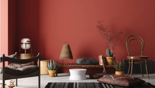
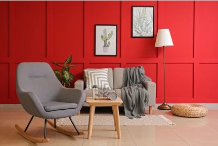
RED energises, and while this is positive, it’s not the first objective of a typical domestic environment. So … you may find that teenagers are into ultra-bright, or dark, individual space. Lounge areas can also look good, as shades of red are cosy and a great backdrop for artwork. But most likely you will select a feature wall for optimum effect, concentrating the value of red just in a limited area. Of course, it can also be used in entrance halls to create an inviting ambience.
It’s rare to find this colour being used for exteriors in Europe, as it attracts a lot of attention. So it may be seen on theatre facades or similar commercial properties. Not precisely Red Light districts, but not so far from these either! But where our privacy is concerned, we tend to be more introverted, and more discreet. We can find a few residential buildings painted burgundy and perhaps salmon or cherry pink. There’s a unique one in Oxford bravely standing out in purple – a bold statement of confidence among neighbours in quite a conservative area!
PANTONE has highlighted magenta as this year’s key colour: this demands great ingenuity to use well.
Impera Italia, therefore, offer glimpses into the RED spectrum, without the full-on intensity this colour brings.
History tells us red was the FIRST colour to be named – after black and white – incredibly exciting. A prestige dye, originally made from cochineal bugs, which fed off cacti in Mexico. This primary colour is now made universally in laboratories (and the cosmetic industry has given in to the female aversion to beauty profiting from cruelty) …
Finally: RED is the supreme colour of DARING!
Which Impera Italia products should you choose?
Our team can advise on how to introduce the boldness of red in your home, without making it overwhelming. When it comes to red, a little goes a long way. Playing with its different hues in smaller areas, on feature walls or even splashbacks can lend an artistic touch to your décor.
The colour Camden, in our Bright Colours range for Microcement – named after London’s Boroughs– is perfectly suitable for areas where a waterproof finish is required! Fortunately for pink lovers, the colour Brent is proof that the lightest hues of red can work on any surface, even worktops!
For a luxurious pink finish, make sure to take a look at our textured metallic paints. The Gimcyn, Gimcyn Luxury and Gimcyn Chroma all have pink options, offering a bit of red, but without the commitment! Morganite, Petalite and Ruby will no doubt give the extra touch any dressing room may need!
Our Venetian plasters can bring out the intensity of the colour red the best, especially the lime-based Grassello di Calce and the acrylic Stucco Veneziano. These polished plasters, with their high-gloss finish, are sure to add a level of opulence to your interiors, elevating the design even further. Make sure to browse our website, for all the different colours and finishes you can achieve with our products! For the adventurous DIY-loving decorators, our Tintoretto paint, in the colour Arno, can be a great alternative to plaster!
If you feel inspired, but are unsure where to start, relax and allow us to take full creative and technical charge of your project!
For any further information, please contact us at 0333 012 4396 or [email protected]. Alternatively, you can also visit our Showroom, based in North-West London.