White & Whiter Shades of Pale
Overwhelmingly the most popular colour ! White is simply classic. But just WHY is this ?
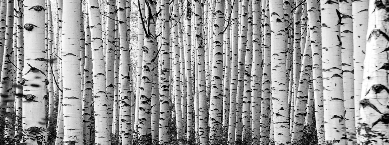
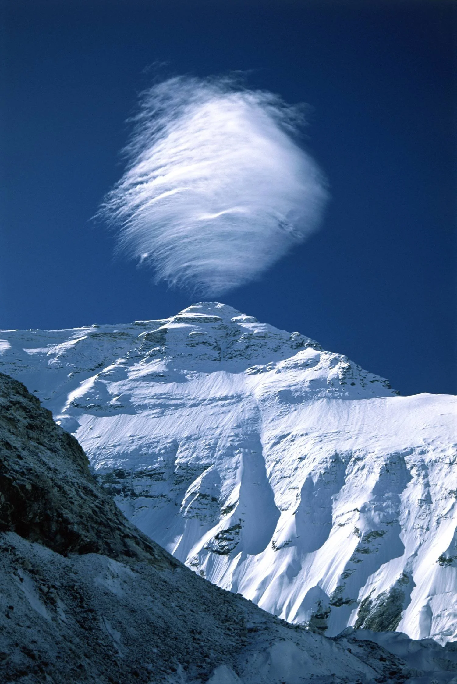
White is technically achromatic, having no visible colour – but the Inuit have a range of words to describe it, being surrounded with snow and ice formations.
Certain Andalucian villages in southern Spain were whitewashed with slaked lime from the 16th century onwards – to keep buildings cooler in the sun’s intense heat – and also in the belief it would protect residents against rampant epidemics such as cholera. These pueblos blancos are dazzlingly beautiful, and now constitute part of the unique UNESCO ‘intangible’ heritage of this area.
The iconic Taj Mahal responds to the sun and moonlight reflecting on its symmetrical marble walls to expose its crystalline translucence. The ancient Sanskrit language differentiates between the white of key substances, such as milk or mother-of-pearl. And Japan defines it according to its degree of inertia or dynamism.
How many ways can we think about White?
We employ it in similar ways in our kitchens, in hospitals – for hygiene; and on the facades of many private buildings, to enhance and unify their appearance. But in contrast, in the UK, this decision will contribute to making our homes extra chilly in the winter months. Those austere villas of Holland Park always look gorgeously stunning – but the heating costs are for sure astronomical.
Traditionally, women wear white to marry and in other contexts, white tuxedos for gentlemen are considered ABSOLUTE. These costumes display us at our best.
We And we write and draw on white paper … or more commonly on a white screen.
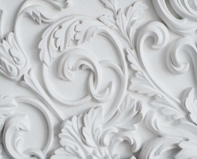
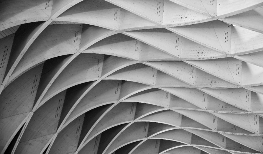
Interior uses of white may experiment with the juxtaposition of different shades and textures to create subtle or even startling effects. We can explore this in Rococo & Baroque ceiling reliefs, architraves and friezes.
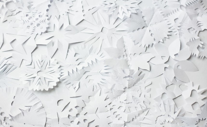
Erik Speer is a marine biologist turned artist, who makes extraordinary collages of natural white materials which can inspire how we deal with our walls and ceilings.
His intricate woven installations beautifully complement the exquisite surfaces achieved with our classic Venetian stucco. For this superior plaster application please contact www.imperaitalia.com for expert guidance.
Paco Rabanne, architect turned fashion designer, made the leap of introducing various metals, paper, and plastic to the catwalk. This innovation has also had a trickle-down effect on the way we think about décor.
With good design we both capture and captivate.
We can make our home a microcosm of elegance based on observation of natural forms, which will intrigue guests and serve to keep us in a balanced state of well-being.
White symbolizes honesty and integrity: is never impulsive or capricious.
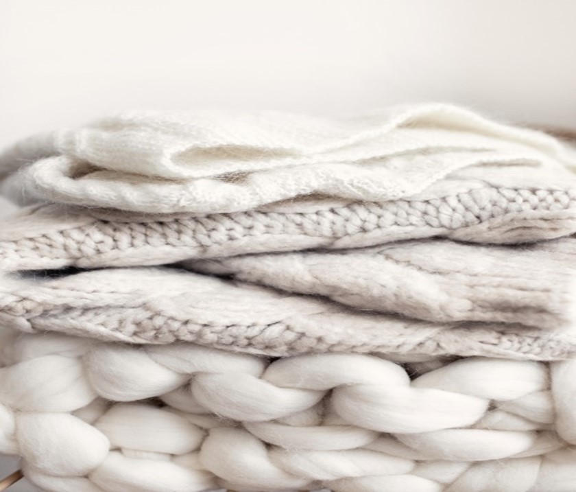
White can enfold us and create layers of comfort. It can cocoon us, and absorb our anxiety.
The marbles of Italy have a white standard which is 100% reliable. But there are variations of this organic product that have an individual appeal, evoking numerous notes and mood progressions from a foundation of neutrality. The lime base of Venetian plaster is made of seashells. Impera Italia features panels on display in Hampstead Gardens: a garden of marble, and bespoke artwork such as Botticino, Carrara and Moscato.
Which colour conveys the most sense of space ?
Magnolia remains the default colour for interior décor when presenting a property to its best advantage – in order for the potential buyer to imagine how they could best transform it.
But since white deflects and balances all known colours, it is a universe in itself. So this ultimately is the prime option for all living areas. It increases the feeling of true capacity – against which we can display the functional and aesthetic objects needed to establish a sympathetic and stimulating domestic environment.
FUN Fact: The first white pigment was laboriously made from lead, a toxic material, but in the early 20th-century titanium oxide was used to create a more brilliant version. The process was pioneered in Norway.
If you want to give your home a timeless and elegant upgrade, employing the white colour, in all its tones can enhance, not just the feeling od space, but the serene, calm atmosphere of the home.
At Impera Italia, we specialise in luxury decorative wall finishes. No matter what finish you had in mind, from high-gloss polished to a more textured matt, our Team is more than happy to help!
For an earthy, natural look, make sure to browse our lime based plasters; known for their breathable quality that allows for use in areas exposed to humidity.
The Marmorino supreme is the best option for those seeking a smooth, but relatively matt finish. For a more textured, gritty finish try Marmorino Fino or Classico, or Travertino for an all-out feature-wall-worthy finish!
If a sleek, glamorous finish sounds more appealing, our metallic paints offer plenty of different options, regardless of which tone of white you choose.
The elegance of our Sioloc and Sioloc Suede, smooth metallic paints is unmatched for any light hue but especially white. If ever you thought it was a dull colour, you are in for a surprise! Try the Ursa Minor, Andromeda and Triangulum colours in sample pots, or click here for a colour chart!
Polaris is great if you want some glitter added! For a textured metallic finish, make sure to browse our most popular paints, the Gimcyn and the Gimcyn Luxury. The Crystal, Diamond and Pearl White colours all offer an opulent finish, that is sure to add an extra touch to your walls!
For those looking to refresh their homes, or do an overall redecorating, implementing light tones, such as white, will surely do wonders for your peace of mind!
For any query, please don’t hesitate to contact us at 0333 012 4396 or [email protected]. If you are London-based, make sure to visit our Showroom in NW11.