What is Colour Drenching, and How to Make the Most of Your Interiors with it?
Colour drenching is a trend that has found its way into the portfolio of designers a few years ago, and since then it has become one of the biggest trends in interior design.
This trend has given way to many different interpretations of it, going from bold statements to more subtle versions, which can be seen in both modern and traditional interiors. As the method can be personalised in many different ways, there is virtually no limit to how many options we have, when it comes to colour drenching.
The method has also been applauded by different designers and colour experts, as a great tool to enhance the spacious feeling in a room, or creating a beautiful, dramatic backdrop, against which the furniture and accessories will be highlighted.
What is Colour Drenching?
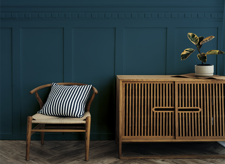
Colour drenching is a method which indicates the application and repeating of the same tone throughout different surfaces in a room. In most cases the colour choice for the walls will usually serve as the base, and the same tone will be used for the ceiling, panelling, bookshelves…etc.
According to Tiffany Duggan of Studio Duggan “It creates a very cosseting, cosy feel and acts as a great base for patterns and artwork to be layered on top.” Many experts agree that it’s a powerful tool to use in interiors, for many different reasons.
If you want to learn how to make the most out of your interiors with colours drenching, keep on reading!
What are Different Methods of Colour Drenching?
Different rooms may require different versions of colour drenching to look their best. A lot can depend on the size of the room, the style it has and what you want to achieve.
Same Tone
This is probably what we first think of when deciding to opt for the same colour throughout the room. The colour can be light or dark, according to preference, but it’s good to remember that the size of the room should be an important factor in the decision making. For the strongest effect of the colour, this is the method that helps us achieve it, and it’s also great to consider it, if you want to implement bold prints in your furnishing, as it will tie together the whole look.
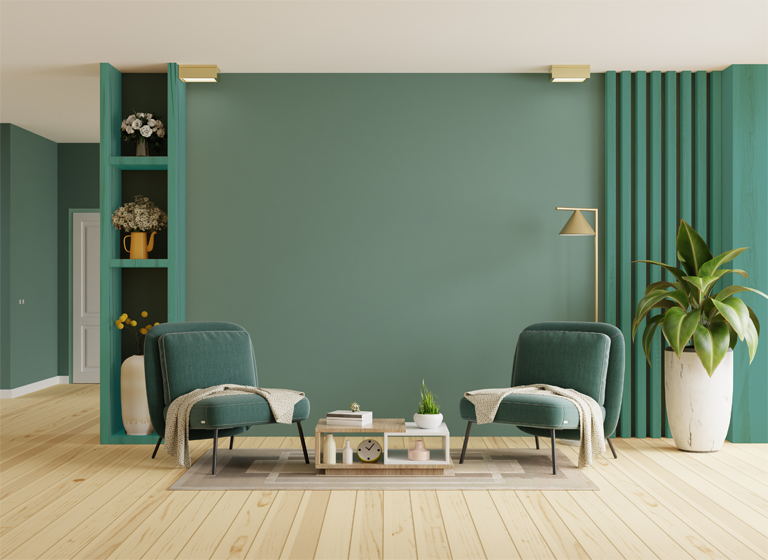
Same Colour but Slightly Different Tones
The second version is the best for those who don’t want to go all out with the colour, or for anyone who feels like the same tone everywhere would be overwhelming. Opting for lighter or darker tones of the same colour won’t make the room lose its cohesive look, but it offset the intensity of the colour chosen.
You could have the ceiling a bit lighter, the woodwork and panelling a bit darker… the possibilities are endless!
Same Tone, But Different Textures and Finishes
If you want to add interest to the different surfaces in the room, but want to stick to classic colour drenching, then you can do so by opting for different finishes on each. For a cosy soft feel, matt finishes tend to work really well. If you are working with neutral, earthy tones, a highly textured finish can make the room feel a lot more natural.
Whether it’s glossy or matt, highly textured or completely smooth, alternating between different textures can go a long way in creating an environment that feels considered and put-together!
How to Use Colour Drenching to Make the Most out of Your Space?
The colour drenching method is one of the best ways to either create a spacious feeling in a small room, or make large space feel warm, cosy!
In Small Spaces
When we work with a small space, it’s easy to make it feel overly busy unintentionally. Even standard sized furniture can feel overwhelming. Opting for colour drenching, when it comes to shelving or tables, for example in a little office nook, can offset the feeling of crowdedness.
In Large Spaces
If you have a spacious room, with an ample amount of free space and grand surfaces, colour drenching can help you in tying the room together and get rid of the unfinished or cold feel that large spaces can have.
Having the same colour everywhere in a large room can be a bit overwhelming, so it’s great to consider alternating between different tones of the same colour, and adding some bold patterned furniture and rugs!
In Lighter vs Darker Rooms
Considering the cardinal direction of the room can help you decide if it’s best to for lighter or darker shades.
North-facing rooms tend to look a bit cooler, whereas the ones facing the east get the warmest light from the sun. A lot can depend on the size of the windows as well. When choosing a colour, take a good look at the room during different times of the day, and make a note of what the room is missing, or on the contrary, what is the quality you’d like to emphasise.
Which Impera Italia Metallic Paints Do We Recommend for Colour Drenching?
For Darker Shades
Serpens – Sioloc Suede
If you’d prefer a matt feel, Sioloc Suede has a slightly textured, velvety finish (depends on tool used to apply) that can add an earthy feel to your home. The colour Serpens is the perfect choice if you want a darker shade, but don’t want to overdo it!
Click here for a colour chart!
Click here for a sample pot!
Brenta – Tintoretto
Darker shades are the best for showcasing the texture of Tintoretto! These colours can look beautiful with a slight texture to them, which will add interest without overtaking the room! The colour Brenta from the Tintoretto range, created to imitate the Venetian plaster look, is the perfect colour for a dark taupe hue!
Click here for a colour chart!
Click here for a sample pot!
For Neutral Tones
Chalcedony – Gimcyn
Our Gimcyn range is popular for a good reason! It’s one of our easiest products to DIY, and the finish can look stunning no matter where you apply it! And this includes shelves!
The Chalcedony colour is a tried and tested option for neutral lovers!
Click here for a colour chart!
Click here for a sample pot!
Mercurio – Infinity
Infinity is our brand new addition to the family of metallic paints! It’s a beautiful, slightly sheer smooth metallic paint, with a slight shimmer to it. If you want to add a little a sheen to your walls and different surfaces, it’s the perfect product. For a light grey, check out Mercurio – a cool-toned, shimmery grey, that can be the perfect addition for a feature wall or an entire room!
Click here for a colour chart!
Click here for a sample pot!
For Bold Colours
Talitha – Sioloc
Sioloc, with a smooth metallic feel and a slight shimmer is a wonderful choice if you want to let the colour be at the forefront of your design! Talitha is cool-toned, dark green shade; perfect for those looking for a timeless and elegant option!
Click here for a colour chart!
Click here for a sample pot!
Sogno – Infinity
Infinity is our brand new addition to the family of metallic paints! It’s a beautiful, slightly sheer smooth metallic paint, with a slight shimmer to it. If you want to add a little a sheen to your walls and different surfaces, it’s the perfect product. For a darker shade, check out Sogno – a modern green colour, that is perfect for both modern and traditional décor alike!
Click here for a colour chart!
Click here for a sample pot!
For an Ultra-Metallic Look
Gimcyn Chroma
If you want to introduce a bolder look in your décor, combining an intense colour with a metallic sheen to it is definitely worth a try! Gimcyn Chroma, with its aluminium base boasts an enhanced metallic look that is perfect for contemporary design! The colour Pyrite, for example, is a beautiful combination of green and gold hues, that can serve as a great statement colour!
Click here for a colour chart!
Click here for a sample pot!
For any questions or queries, please feel free to contact us at 0333 012 4396 or [email protected]! If you are London-based, you are more than welcome to visit our Showroom in Hampstead Garden Suburbs!
Source: sheerluxe.com