The Colour Black

Black is probably one of the most, if not the most divisive colour. To be specific, in colour theory it is not referred to as a colour, but rather a shade.
Some people abhor even looking at it, while others think it’s the representation of absolute sophistication. Whether we like the “colour” or not, we can’t deny that it’s a widely used pigment that has a considerable influence across different fields, both for practical and aesthetic purposes.
It was the first colour used to create illustrations in the prehistoric era. Whilst traditionally it has been associated with rather negative meaning and symbolism, its popular use in contemporary art and design fields, makes you take a second look at the colour.
What are the origins of black? How do we make it? Why did it have such a bad reputation to begin with? And finally, what contributed to the colour becoming such a staple in our modern world?

Origins and the history of the colour black
Black was one of the first colours to be used for illustration, namely for the cave drawings of the palaeolithic era, such as the ones found in the Lascaux Cave, made thousands of years ago. The pigment was made using charcoal and burnt bones.
Throughout history, the use of black was heavily influenced by the symbolism attached to it, which was usually that of grief, evil and death. Up until the 14th-15th century, it was a rather negative symbol in the western culture.
In ancient Egypt and Greece, it was the colour of the underworld. But by being associated with the underworld, ancient Egyptians also thought that Anubis, the God of the underworld, will also protect them against anything bad in the afterlife. So it was a symbol of protection.
In addition, it was the colour of the soil when it was flooded by the Nile, which is a positive for obvious reasons, when one lives in the desert.
In Greece, aside from the colour itself being thought of as the colour of the underworld, black was significant for its use in pottery. The black-figure and red-figure pottery is probably one of the most characteristic feature we think of when it comes to ancient Greece.
By the time the Roman Empire came about, the most noble colours were purple and red, black being associated with the lower classes. Because of the vegetable dyes used at the time, the colour was not very enduring, therefore the fabrics faded quickly. In this instance, we could not have referred to the colour as black, as they faded into brown and grey almost instantly. In Ancient Rome, black was also worn by magistrates, as the colour of the toga, to funeral ceremonies.

In the early middle ages, it was associated, in one part, with power; on the other hand, it was a point of dispute as a religious symbol, between Catholics and Protestants.
A few hundred years later, when quality dyes were first created, government officials and magistrates started wearing the colour in Italy. When new laws were introduced in some parts of Europe, to restrict the use of bright colours such as red and purple, strictly for the use of nobility. Wealthy bankers, especially in Northern Italy started wearing black. Of course, made from the most expensive, quality fabrics.
Ironically, as the quality version of black clothing became popular among the wealthy, the nobility across Europe felt inspired to implement it in their own dressing.
The colour black’s use in printing definitely helped in detaching the colour from any subjective meaning, as it became obvious that its practicality is its most important quality. As it was (and is) the darkest shade, it provided the greatest contrast between a white or off-white background, therefore, increased the readability of the texts.
In China and Japan, where ink wash painting found its origins, black was also popular. The technique was created to use different shades, as the grey tones allowed for the illustration of beautiful landscapes, only using a few brush strokes, and then diffusing it.
What is actually the colour black?
What we perceive as colour, is actually the amount of light that is reflected or emitted by the environment around us or certain objects. What we see as the colour black is a shade of a hue, or colour, that does not reflect any light, but rather absorbs all of it. The darker we perceive the colour to be, the more light it absorbs.
If you are interested in exploring colour theory, and colour psychology further, click here!
The darkest colour or rather shade, up until 2019 was called Vantablack. Invented by Ben Jensen in 2014, the material offered a unique coating that retained “uniform light absorption from almost all viewing angles”.
In 2019, however, MIT professors managed to create what is now known as the darkest material, from vertically aligned nanotubes.
The colour black was produced in different ways throughout history, depending on what the colour was needed for. The most common uses were dyes and inks.
In the beginning, dyes were produced from the roots, bark or even the fruit of different trees, but due to their natural pigments, they usually dyed the cloth brown or grey, therefore, the process had to be repeated several times in order to achieve a darker colour.
During the Industrial Revolution, the synthetic dyes contributed immensely to the popularisation of the colour, as the lower cost made the items affordable to a wider audience.
The first known inks were made by the Chinese in the 23d century BC, using plants and minerals such as graphite. A few centuries later, the India Ink and the “atramentum librarium”, used in Ancient Rome were made, using similar techniques to the Chinese one. The name for the latter came from the latin atrare, which translates to the process of making something black.
The English word atrocious is rooted in this expression. No wonder the colour got such a bad reputation.

Why is black so influential in contemporary design?
Regardless of whether you like the colour or not, black is by far one of the most popular choices when it comes to basically any product we come across. Be it a car, a household item, clothing, furniture etc.
Throughout history, whilst often associated with different subjective meanings, most of which were not always the best, its use across different countries and fields allowed for a change in perspective, when it comes to how the darkest colour is viewed.
Predominantly the colour of superstitious beliefs and religion until the late 13th, the colour black later found its way to represent wealth and power, later in the 14th-15th century.
In the early 1920s, it was further popularised by fashion, via Coco Chanel’s little black dress which became a pillar of fashion, as it inspired many other designers decades after its creation. It was also a staple, as it became an essential part of menswear even sooner, both as business and evening wear.
The colour black grew from a colour, primarily used for practical reasons, such as ink, into a colour that is often used for its associations with formal dressing and elegance. Even when it comes to the colour of a vehicle or furniture.
Its use however, can easily be controversial in the wrong instance! Even today, when seemingly everything is allowed, the appropriate use of black is often a topic of discussion. There are few colours that get this much attention. And there are still widely differing opinions on what the colour actually stands for! Of course, a lot of the time, it depends on the context.

Why is black so influential in contemporary design?
Regardless of whether you like the colour or not, black is by far one of the most popular choices when it comes to basically any product we come across. Be it a car, a household item, clothing, furniture etc.
Throughout history, whilst often associated with different subjective meanings, most of which were not always the best, its use across different countries and fields allowed for a change in perspective, when it comes to how the darkest colour is viewed.
Predominantly the colour of superstitious beliefs and religion until the late 13th, the colour black later found its way to represent wealth and power, later in the 14th-15th century.
In the early 1920s, it was further popularised by fashion, via Coco Chanel’s little black dress which became a pillar of fashion, as it inspired many other designers decades after its creation. It was also a staple, as it became an essential part of menswear even sooner, both as business and evening wear.
The colour black grew from a colour, primarily used for practical reasons, such as ink, into a colour that is often used for its associations with formal dressing and elegance. Even when it comes to the colour of a vehicle or furniture.
Its use, however, can easily be controversial in the wrong instance! Even today, when seemingly everything is allowed, the appropriate use of black is often a topic of discussion. There are few colours that get this much attention. And there are still widely differing opinions on what the colour actually stands for! Of course, a lot of the time, it depends on the context.

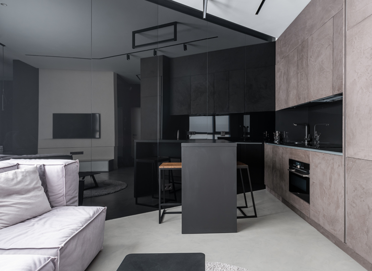
How to implement the colour black in décor?
Going for a statement colour, such as black in our interior design can be a very divisive subject. Some people find it too overwhelming, so even if they decide to opt for a few black accent pieces, it will be limited to a small area or a few objects. And there are those who don’t mind the darker colours, as it can give some grandeur, even to smaller places, according to Home and Gardens.
Whilst it can seem hard to get it right, using the appropriate amount of black in our home or office design can offer some benefits that other shades can’t. Providing a great contrast, adding some clean lines to spaces that would otherwise feel crowded with colour, or using it as a continuous element throughout different rooms to give a cohesive look to the overall decor.
Whether you opt for feature walls, furniture or accessorising with black, it is important to keep a good balance with other colours. The colour black is fairly easy to use (as long as it’s not overdone), as you can use it with neutral but also bright colours, you can customise it any way you want!

Ready to decorate with black? These are the top Impera Italia products we recommend!
If you think your home décor could benefit from a dark feature wall, we have plenty of products that offer a wide range of finishes!
For a bespoke feature wall, that can be customised with textures, stencils or even metallic paint, our Venetian plasters can offer beautiful finishes. Whether you want something ultra-smooth to heavily textured, get in touch to see our samples!
For a high-gloss finish, that can create a beautiful marble-like effect, check out acrylic polished plasters, Luciano and Stucco Veneziano!
If you feel like DIY-ing your next project, check out our Metallic Paints, they are the easiest to apply!
To add a unique look, try our textured metallic paints; the colour Our Montreux is the darkest colour of our Gimcyn range, and for some extra glitter, check out the Obsidian colour of Gimcyn Luxury.
For a smooth semi-matt finish, take a look at Orion from the Sioloc Suede range!
If you have a very specific shade of black in mind, we offer a colour match service, so feel free to browse all of our products, and don’t worry about the colour; we can have it bespoke for you!
For any questions or queries, in regards to your upcoming project, get in touch at 0333 012 4396 or [email protected]. If you are London-based, make sure to visit our Showroom in the Hampstead Garden Suburbs!
Source: Wikipedia, Google Arts & Culture
