What is colour psychology and how can you apply it to your décor?
The impact of colours on our lives has always been present, but it has not always been apparent. It was more so a subconscious understanding of what each colour indicates, depending on the context or environment we see it in, and the particular shade or tint of the hues we come across.
Colour theory, specifically the psychology of colours is a field dedicated to understanding the impact each of these colours have on us. On our mood, thinking, creativity and productivity. A lot of the time we forget to consider just how much our environment, or rather its colours affect us. It feels very different to wake up in a bright cream-toned bedroom, than a dark grey one. Of course, to each their own. Everybody has their preference.
Regardless of that preference though, we can’t deny how big of an impact each hue of the colour wheel has on us. If you want to read about the primary and secondary colours in detail, make sure to check our articles about them here!
What is colour theory?
To put it simply, colour theory is dedicated to understanding what we perceive as colour, and use that information to convey certain messages, according to what the colours are being implemented for. Colour theory today is an established field, built on rules that serve as guidelines, for colours and images, to be the channel we use to illustrate messages, for personal or professional purposes as well.
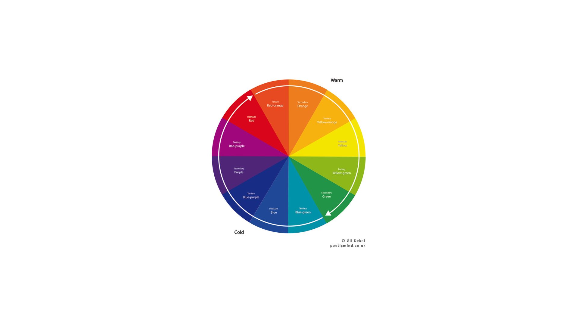
Let’s start with the basics! Colours are divided into three categories; primary, secondary and tertiary colours. If we combine these three categories, we get the full colour wheel.
Based on this colour wheel, the colours can be chosen according to colour schemes (if we want to be professional, and get the full effect of each). These, for example, can be monochromatic, analogous, complementary…etc.
As marketing, brand building and content creating got more popular, so did colour theory. The knowledge of the different hues so far can be used in many many different ways for companies and individuals alike, to establish their image a certain way.
What is colour psychology?
Colour psychology descended from colour theory, and examines how the colours we perceive, therefore the message we receive, influence us.
It is a science-based on how colours affect our brain, and in consequence, our emotions, behaviour and everything that concerns the reaction we have to the hues we see. Of course, we must not forget that a lot depends on age, cultural background and previous experiences.
But all factors taken into account, some colours tend to have a similar effect on people, who more or less share a common background, regardless of personal preference.
How can you implement colour psychology in your interior design?
Considering the time, money and energy companies spend on perfecting their branding, which largely involves colours, it may be worth taking a look at how we can draw some important conclusions about them. And implement what we have learnt in our homes.
If you have already imagined your dream home, and also imagined how certain rooms would have a specific feel to them, then applying colour psychology during the design process can come in very handy!
To explore some of the most important colours in depth, take a look at our articles here!
We all have a natural understanding of what each colour stands for. Bright colours tend to be associated with positive feelings. Neutral, light tones are usually a go-to option for a calm, serene atmosphere.
Darker tones, for the most part, can be associated with negativity, but given their popularity in pop culture, they are a popular choice for many.
Colours are usually associated with certain characteristics. In the Western world, yellow usually stands for joy and optimism. Purple with fantasy or luxury. Blue with the sky or water, or in deeper shades, nobility. Black with elegance. Green with nature or luck. Red is always thought of as a passionate colour, whilst the warm tones of orange/brown as the hues of warmth and relaxation.
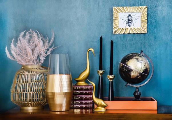
For interiors, many luxury designers incorporate jewel tones in their clients’ homes or offices. These are highly saturated hues named after gems, for example Sapphire Blue, Ruby Red, Amethyst Purple, Citrine Yellow and Emerald Green. These deep tones offer a warm luxurious feel, which can be applied in the form of wall finishes, furniture or home accessories.
Colour psychology can, of course, go a lot further than jewel tones, but it’s a great example of how different colours, but different in tones can complement each other perfectly.
Explore the psychology of colours with Impera Italia!
Which products do we recommend?
At Impera Italia, we are experts in colours. We specialise in decorative luxury wall finishes, for which we also offer a bespoke colour match service. No matter what you had in mind, we will find a way to make it happen!
Even before considering the colour, make sure to check our wide range of products! From metallic paints, to venetian plasters and Microcement, we cater to a large spectrum of clients.
For an earthy, natural-looking finish, our lime based venetian plasters are the perfect products. From a completely smooth to a more rough, textured finish the Marmorino can be suitable. Check Travertino if you are committed to creating the most unique, textured feature wall. Our venetian plasters can be customised, in any way you want them.
For bright colours, a high-gloss finish can lend even more opulence. Our polished plasters, especially the acrylic based Luciano and Stucco Veneziano, are very popular for these types of finishes. Any area that requires a durable, waterproof finish – such as wetroom areas or worktops – ,are all places where our Microcement is perfectly suitable for. Aside from our standard colour range, which heavily relies on neutrals, last year we launched a Bright Colours range, named after the boroughs of one of the most colourful cities, London!
For metallic paints, Sioloc or Sioloc Suede, a smooth metallic paint, that offers a wide range of neutral colours can be easily relied on to offset other strong colours in the room. If you’d like a smooth, venetian plaster-like effect, our Tintoretto matt metallic paint is a great option, and it’s DIY friendly.
One of our most popular products, a textured metallic paint called Gimcyn, boasts plenty of options for colours, it’s also very easy to apply. For an extra touch, Gimcyn Luxury, a pearly textured metallic paint, which has glitters added to it. Gimcyn Chroma, with its aluminium base, gives the most metallic finish of the three.
If you want to take a closer look at the colours, take a look at our catalogues here, which feature hand-applied samples!
For any questions about colour matches or wall finishes, feel free to contact us at 0333 012 4396 or [email protected]. The Impera Italia Team will be more than happy to advise you! Pop into our London Showroom in NW11 if you can!