Why are neutral colours so popular, and how to decorate with them without creating a dull interior design?
Neutral colours fall into the category in which seemingly everyone understands the word, but very few people could explain in detail what these colours actually include.
Neutral colours fall into the category in which seemingly everyone understands the word, but very few people could explain in detail what these colours actually include.
Aside from their main characteristic, which is basically being the lightest tone of the hues on the colour spectrum, it is good to have an understanding what other traits these colours have, to best implement them in our décor!
In our article about colour psychology, we detailed the main aspects that make up this field, and explored the basics of colour theory. In this article, we want to look into how to use our basic understanding of colours to navigate the world of neutrals! What are they? What makes them popular? And can we avoid creating boring, dull interiors, whilst still using an ample amount of neutrals in our décor?
If you want to know more about these modern tones that are essentials in contemporary interior designs, keep on reading!
What are neutral colours?
Neutral colours are both very easy and challenging to define. We have an idea where they start, but we can be unsure sometimes where they finish. The neutral tones can be divided into different categories; pure neutrals, near-neutrals, and the warm and cool tones of the different shades.
Pure neutrals are achromatics that lack any hue, or colour, for example white and grey. Technically black is also an achromatic, but we don’t group it with neutrals, as it’s too dark.
Another colour that frequently gets grouped into this category is brown; however, brown is actually made up of the primary colours; red, yellow and blue. Therefore, it is not an achromatic or a pure neutral like white and grey.
Near-neutrals are probably the colours we often think of when we refer to neutrals.
They are the muted shades of other primary, secondary or tertiary colours. Often the lightest tones. Another variation is creating a colour for a shade of grey, by adding an undertone to it. These undertones can make the neutral tone cooler or warmer.
What makes neutrals essential in contemporary interior design?
They are versatile.
Neutrals are the go-to choice for many designers, first and foremost, because of the number of options available. What the many options have in common, however, is their versatility. There is virtually no limit to how many ways these colours can be used.
They are very popular for paints, flooring, and furniture alike because they give you the feeling of a blank canvas that you can decorate in any way you want, without creating a cluttered feel.
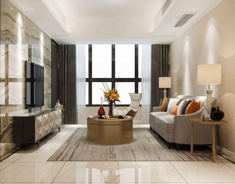
They give a clean, cohesive look.
As contemporary designs tend to favour an overall cohesive décor, preferably in a light or medium toned palette, it’s easy to see why neutrals are at the front and centre of popular designers’ colour scheme.
As mentioned above, it’s easy to decorate with neutral colours without overwhelming the room, and making it feel cluttered. Therefore, it’s not much of a challenge to choose different pieces that complement each other, and still look organised.
They lend durability to furnishings and buildings.
When it comes to pricey furniture and accessories, especially bespoke joinery and furnishings, everyone considers the durability of the items. That includes the colour as well.
If we spend a fair amount of valuable time and money, choosing and designing our décor, we want it to last. Opting for neutral tones, even when it comes to natural materials such as wood, is a safe choice, and we can be sure that the colour will not diminish the value of our furniture, or even our house if we ever decide to sell.
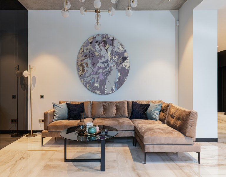
They provide a calm atmosphere.
If you have ever been in a room that was abundantly decorated with the boldest shades, you probably felt impressed. And maybe a bit overwhelmed. These colours are known to trigger strong reactions in our brains, even just by looking at them. That is why colour psychology is getting more and more attention; we understand that different colours affect us in different ways.
On the other hand, if these strong hues trigger strong reactions, neutral tones do just the opposite. Because we don’t react as strongly to these light hues, we feel a lot calmer in a space decorated with neutrals.
Designers and developers alike understand the importance of colours, therefore, when it comes to the development and interiors of commercial projects, they always consider what they want their clients to feel. Hence all the beige tones in show homes and hotels.
How to decorate with neutral colours?
Whilst the choice can seem easy, as all the neutral tones look incredibly similar to the untrained eye, a lot of consideration can go into picking colours that will complement the overall picture the best.
Choose the undertones widely
One of the most important aspects of decorating in general is picking the undertones that match. That is especially true for neutrals, as the colour scheme can seem off if we randomly mix everything.
The two main categories for undertones are warm and cool tones. Regardless of the choice within these two categories, as long as we respect the line between these two, it will help a lot in the overall finish.
It’s also important to combine at least a few different tones, to add layers and some interest to an overall less adventurous palette.
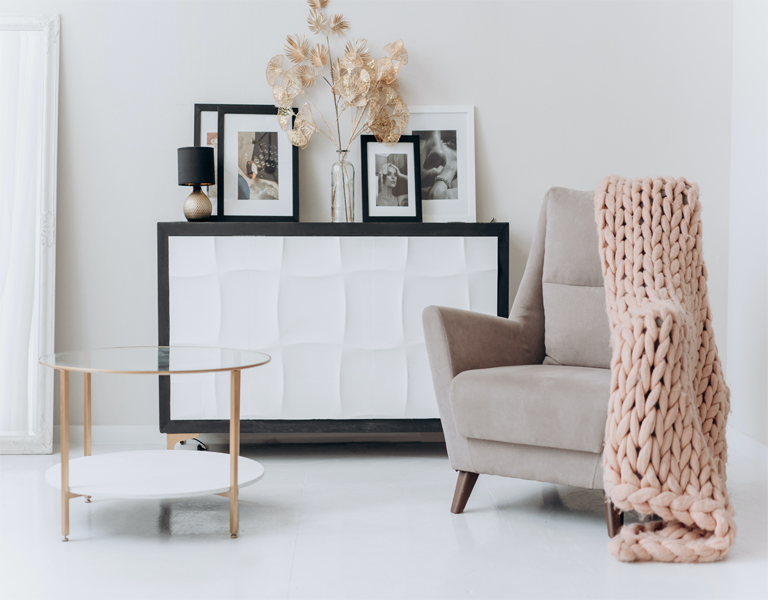
Pick an accent colour
In order to avoid creating a dull interior design, we should consider adding some extra details. Either pick and accent colour, or play with different textures. Preferably both!
By choosing an accent colour that will give a focal point (or points) to the room, it will be easier to decorate around that, and still create a cohesive look. If adding a trendy touch to your home, – aside from the timeless investment pieces – sounds appealing, then this is the best way to incorporate those elements.
The trendy colours and patterns come and go, but changing a few throw pillows and rugs is still less expensive than redecorating the whole room!
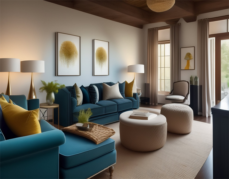
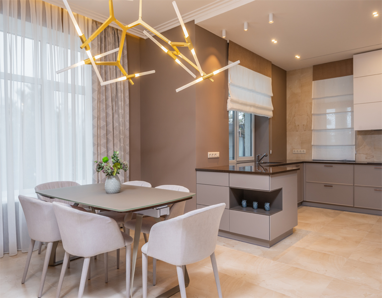
Play with texture
In order to create a comforting feel in the room, instead of a cold detached one, it’s important to create layers.
As it was explained above, layering with different tones or undertones is the first option (and a recommended one), but layering with different textures will ultimately complete the room.
This part is entirely dependent on what interior style we want to achieve! Be it minimalistic, modern, or rustic, there are plenty of options available for those who want to explore! It is also important to consider where we want to drive attention and focus on those points, instead of randomly stuffing everything we like. Even though it’s tempting!
Care to refresh your décor? Take a look at our selection of Impera Italia products for the best neutrals!
Decorating with neutrals can be an incredibly fun task, but it’s important to acknowledge that a good décor starts with the basics. Like the colour of our wall! And of course, its texture.
At Impera Italia, we offer a wide range of different finishes, from highly textured to completely smooth, which can serve as the perfect backdrop for your furnishings!
For a minimalist interior
If you want a simple and clean look to welcome you and your family in the room, there is no need to worry much about the walls. But it’s also good to choose a finish that adds interest to the neutral tones, and saves you the headache of having to think about decorating your walls too much.
For a beautiful Limewash that you can DIY, try our Lime Eco: it’s the ideal product to add some laid back details to your walls, and it’s a very budget friendly option!
If you want a slightly more textured look, try our Concrete Paint! It’s an easy-to-apply textured paint, that you apply on its own in one colour, or combine with another one to create a concrete-like finish! Both of these products are natural, lime-based paints, therefore, aside from being highly breathable, they have antibacterial and hypoallergenic properties!
Click here for a sample pot of Concrete Paint or Lime Eco!
For bold glamour
Our textured metallic paints are the best option for those who want an opulent feature wall to complement the rest of the room!
Gimcyn and Gimcyn Luxury have the most elegant options for neutral, beige tones! It’s a very practical alternative to wallpapers, and both paints lend an ultra glam look to your home!
If you want the most elegant option, Gimcyn Luxury has added glitter that will reflect beautifully with the right amount of light in a room! Click for a colour chart for Gimcyn and Gimcyn Luxury!
For laid-back elegance
Our smooth metallic paints, like Sioloc Suede and Tintoretto both offer a semi-matt velvety finish, that will no doubt complement the rest of your décor without driving the attention away. Click here Tintoretto and Sioloc Suede colour chart!
For an extra touch, check out Sioloc; a shimmery, smooth metallic paint that complements the neutral tones perfectly! Click here for a colour chart!
For a bespoke look
For those interested in having a bespoke finish for their feature wall, or the whole room, we recommend our Venetian plasters, as we have plenty of options and decorative tools available!
Click here to explore our Venetian plasters, both lime-based and acrylic!
If you have any other questions or queries, feel free to visit us in our London Showroom! Alternatively, please call us at 0333 012 4396 or email us at [email protected]!