Why did grey become so popular, and what makes the colour a staple in modern interior design?
When it comes to the colour grey in interior design, whether we like the colour or not, we can all agree on one thing: it’s everywhere!
Whilst it first started to become the ultimate ‘it colour” almost a decade ago, its popularity seems to persist. Some industry experts claim that the colour is over, and people are looking to other hues to incorporate into their interiors.
Yet, what we actually see based on the choices people outside of the industry make, the colour seems to be as popular as ever. Just type #greyhomedecor or #greyhome on Instagram. Both tags are still used frequently!
Whether you think grey is an ultra-modern colour, that is perfect for a minimalistic contemporary look, or you want to introduce it using more traditional furnishings, you can’t go wrong with it.
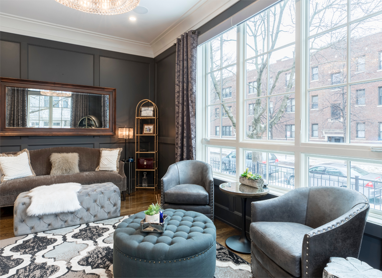
Both examples, and several others in between, have been tried and tested by enthusiastic decorators and experts alike, and when used right, the colour grey seems to be the hue that gives the décor an overall cohesive look. Especially when different shades of it are used.
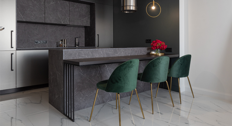
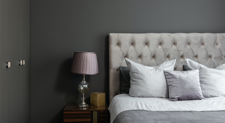
Everywhere we look, grey somehow seems to be there. Especially when it comes to interiors. Be it a bathroom, bedroom or even a living area, grey has become a staple in modern homes!
So what makes those in the opposition against the colour hate it? And what makes grey popular in the first place? How did it become one of the most widely used shades?
What actually is grey?
Whilst we often refer to grey as a colour (as we do with black and white), technically speaking it is not.
As we have discussed in our article about colour theory and colour psychology, colours are only what we perceive of the light that is reflected or emitted by an object.
White reflects the light, without omitting any hue, or colour, which makes it an achromatic. Black is also an achromatic, but the black shade actually absorbs most of the light, without reflecting it. The darker we perceive something to be, the more light it absorbs.
If you want to read about the ‘colour’ black in depth, click here! For our article, about white, follow this link!
Grey, therefore, is not a colour, but a shade between black and white. Which also makes it an achromatic. It is hard to find a shade that is thought of as the standard grey, as it basically includes a spectrum between black and white.
What makes grey a colour popular in interior design?
1. It is neutral.
Being an achromatic, grey does not reflect any ‘colour’ therefore, it is the best option when you want something simple. Perhaps you want a minimalistic look, or you just want to offset other colours, either way the colour grey can do the job!
Neutral colours are definitely gaining momentum, perhaps more than ever before, as with the rise of social media, and people sharing their homes, neutral colours seem to look the best in the background!
2. It is versatile.
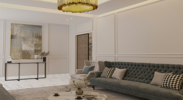
Because it is thought of a neutral colour, it means that it can be used pretty much everywhere and be paired with anything. You can go all out and decorate everything in grey (although incorporating other shades of it and different textures is highly recommended), or use it as the backdrop for your more extravagant pieces.
If you go for a darker shade, it can be a statement colour on its own! The possibilities are simply endless.
3. It has many different shades.
Grey in general is popular because there is no standard shade of grey. Sure, we all have something pop into our minds when we think of it, but if someone would ask us to describe it, or compare it to something, we would be confronted with many different options! Is grey the colour of the graphite? Is it lighter like some metals? Does it have any undertones, like most textiles?
4. It has a simple, elegant look.
Perhaps it has to do with silver, platinum or any other precious metal but grey has also come to be associated with elegance. Many think that simplicity is elegance. And what are the most simple colours? Ironically the ones that have no colour!
But whilst white usually seems cold, and black is almost always too dark, grey is the happy compromise, that can extend into any room, be used on any furniture or textile, especially in different textures. The colour grey can look very sophisticated, and it is because it’s a bit too simple!
5. It makes other colours pop.
Another popular opinion that industry experts share, is about grey used as the backdrop, which highlights the rest of the accent colours in the room.
There is no colour that you can’t use with grey, and chances are whoever you choose, using some grey in your décor will help tie the whole look together, without making the area feel crowded!
6. It is practical.
Last but not least, grey can be incredibly practical! It is probably the most popular colour for contemporary furniture in general,but especially in gardens and on terraces!
If someone owns a pet, or is worried about any light dust or dirt getting on the furniture, they usually opt for grey textiles with a rough texture, as they seem to be the hardest working materials for frequently used areas.
Sure, the pet hair and the dirt are still there, but is it glaring like it would on a black or white sofa? Probably not. Grey can hide a lot!
How can you incorporate it in your décor?
1. Use different textures!
As it is not necessarily the most interesting shade to look at, it is a great idea to spice your grey items up by opting for a textured version of it, or to layer with other grey, textured items. Like throw pillows and blankets!
2. Use different shades!
Depending on what you use the colour for, many variations exist.
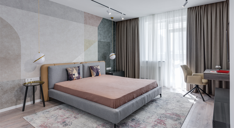
For a statement piece or furniture, or a feature wall, it is best to use the darker shades, whilst if you want to drive the attention to other colours or accent pieces, it’s recommended to choose the lightest tones.
The choice can also depend on the amount of natural light the room gets. The more you want to brighten your space, the more light tones you should incorporate.
3. Add some natural materials!
Cotton rope and woven baskets are some great home accessories if you are missing some natural touches from your décor. If possible, it’s good to incorporate some elements like wooden floor and furniture to offset the cold feeling that can come with too much grey.
Natural fabrics like linen and cotton can also be great additions, depending on the decor you want to create!
4. Don’t forget the plants!
Of course, when it comes to the natural touch, plants are a must! If you are committed to matching everything to your grey décor, try some stone like pots to complete your interiors!
Interested in decorating? What are the best products we recommend from the Impera Italia selection?
For a minimalistic look
If you want to add some nice grey tones to your home, and you also want a luxurious, smooth finish, the Sioloc Suede and Tintoretto metallic paints are the perfect options. Their easy workability allows for versatile applications, so you can create a completely bespoke finishes!
The colours Ophiochus and Serpens from the Sioloc Suede range, and the Reno colour from Tintoretto are great options to consider!
For a Sioloc Suede colour chart click here!
Click on this link for Tintoretto’s colour chart.
If you want a textured, concrete-like effect for a contemporary look, make sure to check out our Concrete Paint!
It was designed to give you a very similar finish to concrete, but without the additional work! It’s the perfect DIY product, that unlike concrete, can be applied to walls and ceilings.
Click here for a sample pot!
For a waterproof finish
Our Microcement is the quintessential product for a modern home!
It’s a versatile, durable and waterproof coating system that allows for plenty of creativity when it comes to where you apply, and what finish you want to achieve!
Whether you want something smooth, textured or something in-between, you can choose to personalise the final look, any way you want to! For some of the best grey options, check out the London, Liverpool and Manchester colours. They are available in a Sample Kit, Wall Kit, Floor and Wall Kit, and Worktop Kit as well!
If you want to sample several colours, click here for a Mood Board Set!
For a glamorous feature wall
For those who want to enhance the colour with a special effect, we recommend our textured metallic paints!
Whether you end up going for a lighter or darker shade, a light texture and iridescence can definitely help add some interest to the colour, and create the perfect feature or media wall!
For Gimcyn, which is a silver-based textured metallic paint, the Sapphire, Laura’s Colour and the Moonstone are all popular finishes for the grey enthusiasts!
For a luxurious, textured pearly finish, check our Gimcyn Luxury in the colours Obsidian and Victoria’s colour! Check out the colour charts for Gimcyn and Gimcyn Luxury!
If you want to go the extra mile, and want an enhanced metallic look and feel for your wall treatment, make sure to browse our Gimcyn Chroma colour range! It has the most options for grey tones, which go from very light silver to darker, graphite-like shades. Click here for a colour chart!
The Impera Italia Team will be more than happy to help you with any enquiries on your upcoming project! Give us a call at 0333 012 4396 or email to [email protected]! If you are London-based, pop into our Showroom in the Hampstead Garden Suburbs!